


📊 Introduction to Candle Anatomy and 10 Important Technical Analysis Patterns
Unlock the secrets of candlestick charts by mastering their anatomy. Candles consist of various components, each providing valuable insights into market dynamics. The body shows the price range between the opening and closing prices, while the wicks (or shadows) represent the highest and lowest prices achieved during the specified time period. Understanding the interplay between these elements is crucial for decoding market sentiment and predicting price movements. By understanding the principles of candlestick anatomy, traders can establish a solid foundation for effective decision-making in crypto trading.
A technical chart pattern or chart pattern is a graphical representation of the price and trading volume of a financial asset that uses specific lines, points, shapes, and patterns to analyze price behavior. These patterns are typically used as a predictive tool by market analysts and may include simple patterns such as trend lines and support/resistance points, or more complex patterns such as candlestick formations, head and shoulders, inverse patterns, and more. Technical chart patterns are commonly used for analyzing stock markets, currency markets, global markets, and other financial markets.
To familiarize yourself with the patterns mentioned above, using an article from the IG website, we will look at 10 key chart patterns that every trader should be aware of regarding their characteristics and functions.
📐 What is a Chart Pattern?

A chart pattern is a shape in a price chart that helps you predict future price behavior based on how the price has behaved in the past. In other words, the basis of price patterns is rooted in the repetition of history, and if an asset's price has repeatedly shown consistent behavior in the past, it will most likely show the same behavior in the future.
Chart patterns are the foundation of technical analysis and can be very effective; provided that when examining price charts, the trader knows exactly what they are looking at and what they are looking for.
🏆 What is the Best Chart Pattern?
No single chart pattern is the best on its own, and depending on market conditions and the asset in question, different patterns can be useful. For example, the head and shoulders candlestick pattern may be useful in the stock market, while the gap candlestick pattern may be more suitable in the currency market. Additionally, using technical analysis alone is not appropriate for making decisions in financial markets and should be combined with fundamental analysis and other market factors. Chart patterns are predominantly used in candlestick charts because candlestick charts help traders somewhat more easily observe the opening and closing prices of trades within a specific time frame.
Some patterns are more suitable for volatile markets, while others are not very effective in such markets. Some patterns are better used in bullish markets, while others are suitable for bearish markets.
However, the important point is knowing the "best" chart pattern for the "specific market" in which you are active; because if you use the wrong pattern or do not have sufficient information to choose the appropriate pattern, you will miss the opportunity to profit.
🛡️ Defining Support and Resistance Levels
Before delving into the details of various chart patterns, it is better to take a brief look at the concept of "support and resistance levels."

A support level is a level at which an asset's price does not fall further and, upon approaching or touching it, rises again. A resistance level is a level at which price increases are often halted, and the asset's value begins to decline after hitting it.
Support and resistance levels can be used as important points for making decisions about entering and exiting the market, as well as for determining potential price levels in the future.
The formation of support and resistance levels is caused by the balance created between buyers and sellers, or in reality, supply and demand. When there are more buyers than sellers in the market (or demand exceeds supply), the price usually increases. Conversely, when the number of sellers exceeds the number of buyers (supply exceeds demand), the price typically declines.

For example, an asset's price may be increasing due to demand exceeding supply. However, eventually the price reaches the maximum amount that buyers are willing to pay. At this level, demand decreases, and buyers are likely to decide to exit their trading positions. In other words, here a type of resistance level is formed; that is, a price that buyers are not willing to go beyond. Therefore, they close their trading positions or stop buying.
In such conditions, we can see that supply gradually increases relative to demand, and as a result, the price decreases. When the price has fallen sufficiently, buyers are likely to become willing to return to the market and purchase the desired asset at a more acceptable price. In this case, the balance between supply and demand is restored, and a support level is formed. The support level in this example is the buyers' acceptable price at which they are willing to purchase the asset.
Following increased purchases and the continuation of relatively increasing demand relative to supply, the price once again approaches the resistance level. Interestingly, support and resistance levels are proven and reliable concepts. In most cases, an asset's price does not break its resistance level; but if this happens, that same resistance level can become a support level.
🧩 Types of Chart Patterns
Chart patterns are generally divided into three categories: "continuation patterns," "reversal patterns," and "bilateral patterns."
🔸 Continuation patterns indicate that the trend is continuing;
🔸 Reversal patterns indicate the probability of a trend direction change;
🔸 Bilateral patterns signal a volatile and unstable market; a market in which the price may move in any direction at any moment.
All three can be used to enter short (sell) and long (buy) positions. In other words, these patterns help you predict price trends and even trade in bearish markets just like in bullish markets to make a profit.
Of course, the most important point to remember when using chart patterns as part of your technical analysis is that these patterns do not guarantee market movement in the predicted direction; rather, they are merely an indication of something that is likely to happen.
Now, with all this information in mind, we can examine 10 important technical analysis patterns that all traders should be familiar with.

1. Head and Shoulders Pattern
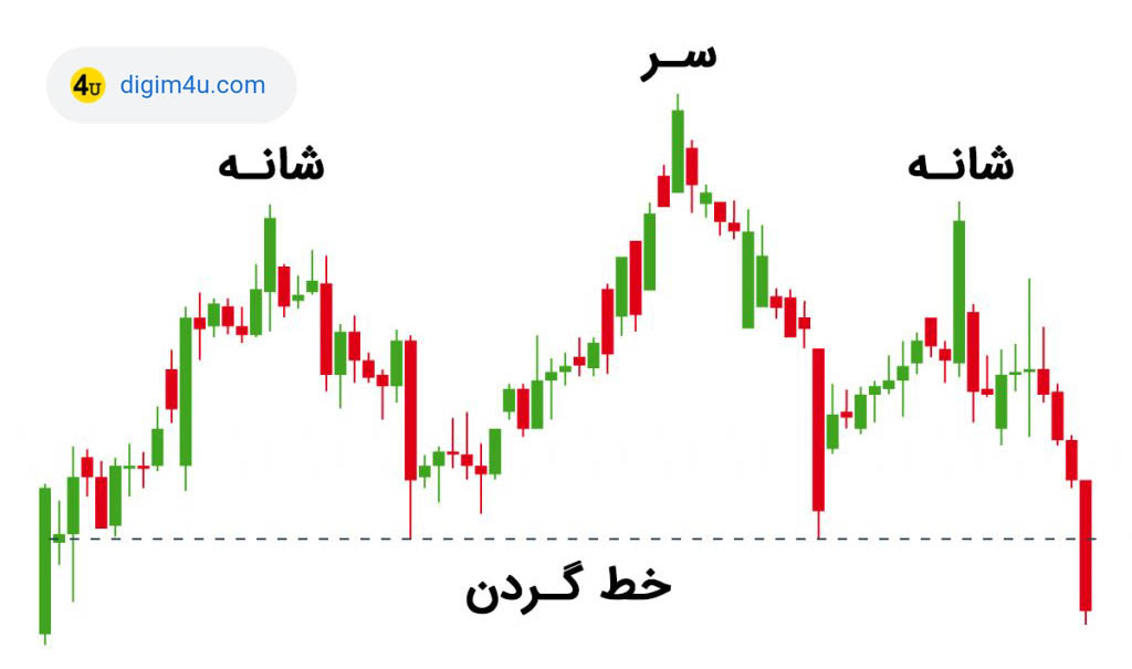
This is a reversal pattern. In the head and shoulders pattern, the first and third peaks are usually shorter than the second peak, but their common point is that all three touch a support level (which is called the neckline, confirmation line, or breakout line). When the price returns to this support level from the third peak as well, we should probably expect the neckline to break and a bearish trend to begin.
This pattern is recognized as a signal for a change in price movement direction in the market. If the price moves downward from the first peak point and then reaches the neckline point, there is a high probability that the price will move toward the second peak point. If the price reaches the second peak point, there is a high probability that the price will move downward.
Using support and resistance levels and the head and shoulders pattern, we can better analyze the market and make better decisions about entering and exiting the market. Additionally, these tools can be useful as guidance for determining potential price levels in the future.
2. Double Top Pattern
The double top or double ceiling pattern is another pattern that traders use to identify trend reversal. The double top pattern occurs when the price rises to a certain level and then falls; then it rises again to the same resistance level and falls again to the previous level. In such conditions, there is a very strong probability of a bearish trend beginning.

3. Double Bottom Pattern
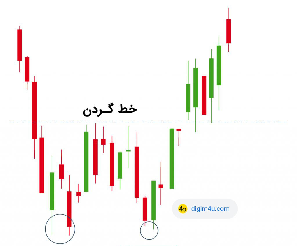
The double bottom pattern is exactly the opposite of the double top pattern. In this pattern, the price decreases to a certain support level and rises again. Then it decreases again to the same support and rises to the same previous resistance (neckline). In such conditions, we should probably expect a strong bullish trend. Therefore, the double bottom pattern is also a reversal pattern; with the difference that it shows the end of a bearish trend and the beginning of a bullish trend. For this reason, it is called a bullish reversal.
4. Rounding Bottom Pattern
The rounding bottom or bottom semi-circle chart pattern, in most cases, represents the end of a bearish trend and the beginning of a bullish trend. This reversal pattern usually forms after a long-term bearish trend and indicates that the bearish trend is coming to an end and we can expect the beginning of a bullish trend.
In the image below, you can see an example of a rounding bottom pattern. In this example, the asset's price is in a bearish trend. However, after forming a rounding bottom pattern, the trend reverses to continue moving in an upward direction.

Traders often tend to invest and buy at two points in this pattern: when the price is near the bottom of the chart and when the trend has continued and crossed the resistance level.
5. Wedge Pattern
The wedge pattern forms when an asset's price movements are compressed between two diagonal trend lines. Overall, there are two types of wedge patterns: Rising Wedge and Falling Wedge.
🔸 Rising Wedge Pattern
The rising wedge pattern forms around a trend line that moves upward between two diagonal support and resistance lines. In this case, the slope of the support line is steeper than the slope of the resistance line. This pattern generally indicates that the asset's price will likely break the support level and experience a sharp decline.

🔸 Falling Wedge Pattern
The falling wedge pattern forms between two downward-sloping diagonal resistance and support levels. In this case, the slope of the resistance line is steeper than the slope of the support line. Unlike the previous type, the falling wedge indicates that the price will most likely break the resistance and enter a bullish phase. As you can see in the example below, after entering the falling wedge, the price trend broke the resistance and returned to an upward state.

Rising and falling wedges are considered reversal patterns. A rising wedge indicates the probability of a bearish market, and a falling wedge indicates a bullish market.
6. Cup and Handle Pattern
The cup and handle pattern is a continuation pattern and a combination of 2 patterns: rounding bottom and wedge, which forms in a bullish market and signals the continuation of the bullish trend. The cup and handle pattern shows a short period of bearish sentiment in a bullish market, while the overall trend will continue in an upward direction after forming this pattern. In this pattern, the cup resembles a rounding bottom chart pattern and the handle resembles a wedge chart pattern.

After forming the rounding bottom pattern, the price will likely go through a period of temporary correction, which is known as the handle. The reason for this naming is that the correction trend is limited to two parallel lines drawn in the chart above. Eventually, the asset exits its short correction period (the handle) and continues the bullish trend.
7. Pennant or Flag Pattern
The flag pattern forms when an asset, after going through an upward or downward trend, enters a period of price consolidation. The general concept of the flag pattern is that this price consolidation period is temporary and the trend will return to its previous state. Therefore, the flag pattern can be considered a continuation pattern.
Flag patterns show a short pause in an active market. In fact, one of the necessary and essential conditions for forming a flag pattern is that before they occur, a sharp movement in the form of a straight line must have occurred in the market (which we call the flag pole). Then the market enters a brief pause in the flag section (rests) to start moving again in the same previous direction.

The flag pattern can be both bullish and bearish. For example, in the chart above, you can see a bearish flag pattern. As you can see, the price has been in a bearish state from the beginning. Then we witnessed a period of price consolidation that created a shape resembling connected flags, and after that, the price continued its bearish trend again. We can observe a similar occurrence in bullish trends as well.
At first, the flag pattern and the wedge pattern may seem very similar; but if you look more carefully, you will notice that these two patterns are completely different. The first difference is that the wedge pattern is always rising or falling, while the flag pattern is always in a horizontal state. If you look at the flag pattern in the chart above, you will see that the price trend during this period is neither rising nor falling, but is in a horizontal state. Additionally, the flag pattern is a continuation pattern, while the wedge pattern is considered one of the reversal patterns.
8. Ascending Triangle Pattern
The ascending triangle is a bullish continuation pattern and indicates that the trend will likely continue in an upward direction. The ascending triangle pattern is drawn by plotting a horizontal resistance line along the swing highs and also a diagonal support line along the swing lows. In the image below, you can see that the resistance line is a horizontal line that has connected the swing highs. Similarly, you see the support line connecting the swing lows with a positive slope. The combination of these two lines creates a triangle-like shape, which in the trading world we call an ascending triangle.

The ascending triangle pattern shows the continuation of a bullish trend. As you can see in the image above, the trend has continued its upward movement and has also broken its resistance.
9. Descending Triangle Pattern
The descending triangle is also a continuation pattern, with the difference that it forms in bearish trends and shows the continuation of the bearish trend. Therefore, this pattern can be used to enter short positions and profit from bearish markets.
As you can see in the image below, the resistance line that has connected the swing highs is a downward line, while the support line is in a horizontal state. The combination of these two lines creates a triangle, which in the trading world is called a descending triangle.
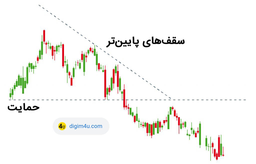
As mentioned, the descending triangle shows the continuation of a bearish trend. It is also observable in the image that the trend eventually broke its support and descended below it. This event indicates that sellers have gained control of the market and the probability of trend reversal is very low.
10. Symmetrical Triangle Pattern
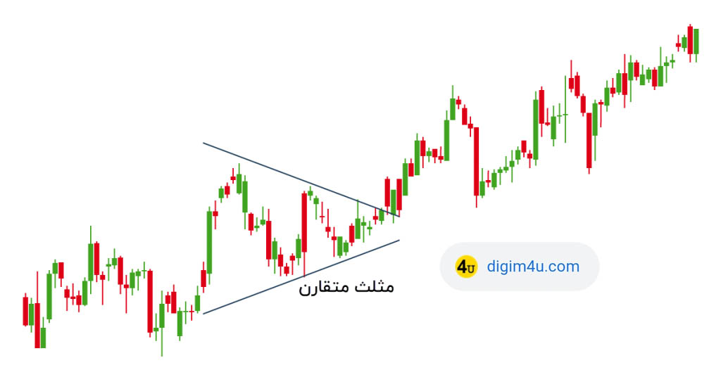
The symmetrical triangle pattern is also a continuation pattern and has 2 types: bullish and bearish, meaning that after the pattern forms, the trend often continues in the same previous direction. The only difference between this pattern and the regular triangle patterns is the shape of the triangle formed in them. The symmetrical triangle resembles an isosceles triangle, while in the previous patterns, we witnessed a type of right triangle.
In terms of function, this pattern is no different from the previous patterns. In the chart below, you can see the symmetrical triangle pattern. As you can see, the trend has been in an upward state from the beginning. Then we see a symmetrical triangle that causes price consolidation, and after that, the price has returned to its bullish trend again. A bearish symmetrical triangle forms with exactly the same definition, but in bearish trends.
🕯️ Types of Bullish and Bearish Candles
⚡️ Published on OKX Exchange Twitter

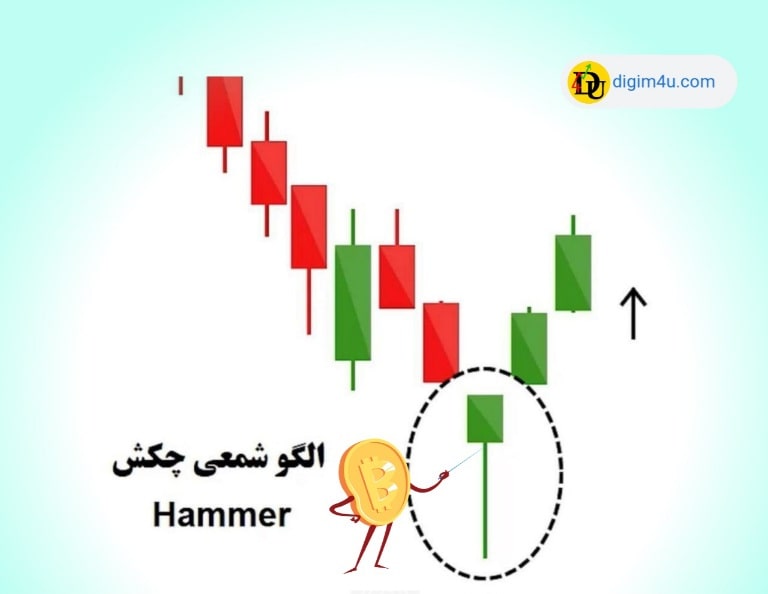
🔨 Bullish Hammer Candle
◼️ This pattern consists of a small candle or a small body and a long lower shadow that resembles a hammer and usually forms at the end of a bearish trend, indicating a change from a bearish to a bullish trend.





🔴 Coins whose trust index is in the red category are not suitable for long or short-term holding...
🟠 Coins in the orange and yellow categories require caution...
🟢 Coins in the green category can be held for a period of time...
Online Technical Analysis |
🏛️ Select Exchange: --- | ---
 By viewing charts on a computer or enabling the DESKTOP SITE option, you will get a more comprehensive view.
Signal Buy and sell using Bollinger Bands 20
The Bollinger chart (from the Volatility Indicators category) is an analytical tool used to evaluate the market situation.

What is Technical Analysis?
In this analysis, using charts and related information including price, volume, and various techniques and tools, the overall situation of the market is examined.

ONCHAIN Charts
On-chain data is very important information that can be used to review the situation of the digital currency market.

📰 NEWS
There are always other effective factors on crypto market prices. Decide to buy or sell calmly and avoid any haste. Before buying or selling any token, check the Bitcoin analysis once. The most important issue is investment security.
If charts are not visible, please update your browser or use the latest version of Google Chrome.